While data and evidence are at the heart of informed decision-making for students, we’d like to dive into the often-underestimated power of color-coded data. Color coding is a vital tool that makes sometimes complex data accessible to all and has become an indispensable tool for enhancing data analysis and facilitating informed discussions.
Color-coding is a crucial element for making data accessible and simplifying analysis. Educators often find themselves faced with raw data sheets that present us with reams of numbers, letters and possible suggestions for interpretation (of course, depending on the program or data tool being used). It takes time to even begin to understand the spreadsheet or print out with its ledgers of information. We often see teachers and principals' first response to the data is to gather up their highlighters and begin to highlight commonalities, highs, lows, and noteworthy items.
Clearly, color coding saves an enormous amount of time when interpreting data. It also provides clarity for educators and leaders, allowing them to focus on interpretation and next steps without lengthy after school sessions that require manual annotation to arrive at next steps. The question that often arises next is: who should be responsible for color coding?
The responsibility for color coding largely depends on the context of the school. Some leaders prefer to take on this task themselves to prepare for discussions. Learning the basics of sorting and conditional formatting in tools like Google Sheets or Microsoft Excel empowers leaders to quickly and efficiently color code data.
Alternatively, schools are filled with individuals who have great interest in and talent for creating spreadsheets. Executive assistants are often proficient in data manipulation and can contribute significantly to the process. There are lots of online tutorials to support this work - just ‘Google it’.
Tailoring Data for Collaborative Team Meetings

Color coding isn't merely about visual appeal; it serves a deeper purpose in tailoring data for different teams. For example, in collaborative team meetings, color coding allows for a focused discussion on specific groups of students. This targeted approach helps identify students in need of intensive support or those who could benefit from adjusted classroom practices.
As seen below, this grade 7-8 overall data has been organized and sorted to show the cohort of students who will be considered in a collaborative team meeting. At the top of the sample, this school has identified criteria to establish the color coding and the sample is sorted according to the criteria. As you may notice, in this arrangement students are not in alphabetical order as the data has been sorted to focus on current scores and sorted into the color groups according to the criteria stated at the top. Sometimes, a norm referenced publishers assessment will determine this criteria and establish the color coding and sometimes schools need to set the criteria for their data and evidence and encourage teachers to apply these criteria while entering or reviewing data.
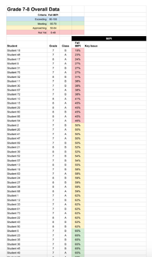
The goal of color coding in this format is to facilitate conversations and flag students for discussion. By categorizing students as "red" "yellow" or "green" based on established criteria teams can easily pinpoint who needs support and tailor interventions accordingly. This format is especially important for the collaborative team meeting as the students we are focussing on are students who are slightly below or have missing skills. This directs us then to focusing on the students who are surfacing in the yellow category.
The power of color coding lies in its ability to initiate discussions and prompt action. Following the color coding of data for Collaborative Team Meetings, the next step is to identify key issues that will initiate the conversation at the next Collaborative Team Meeting. This is done simply by adding an additional column to the spreadsheet where key issues can be identified (as seen in the example). Each time a team reflects on their data prior to their Collaborative Team meeting, they erase the previously identified key issue and then note a new one based on the data examined.
Another direct impact color coding has on Collaborative Team Meetings, is the adjustment in the pre-meeting organizer to encourage team members to examine their data in order to identify students for discussion. This template encourages teams to identify students who are in the yellow for initial discussion in the key issues process followed by a student in the green or blue (excelling) and then finally a student in the red for a brief review of supports and possible transition to the School Support Team. As part of the process for preparing for Collaborative Team Meetings, we have now ensured a direct application for the review of data prior to the meeting to ensure we are talking about the right students in the right meeting.

Data for Collaborative Planning Teams

Color coding extends its benefits to collaborative planning by highlighting priority focus areas for teams of teachers to examine for an entire cohort of students. Analyzing color-coded data allows teams to identify gaps in particular areas that may require additional instructional focus. This provides the foundation for teams to design goals for collaborative planning that specifically target areas of development for classroom instructional planning. Color coding simplifies this process, making it easy to identify where efforts should be concentrated.
The following visual provides an example of numeracy data reviewed for the purpose of collaborative planning. Students are arranged in alphabetical order and the primary focus now becomes the overall responses provided by students and determining if there is a question or task that a significant number of students were challenged by. Reflecting on this analysis, teachers color code the areas of concern. Our response then becomes two fold, we examine the question to see if there is a significant flaw in the assessment tool or we design strategies to increase students' understanding in that particular identified area.

In this sample, the color coding is primarily orange as a standard for identifying overall areas of concern. However, establishing criteria for red, yellow, green would allow for a more detailed examination. For example, red might be used for areas of significant concern (cohort score of less than 40%) yellow for areas of development (cohort score of 41-59%) and finally green for areas that appear to be manageable (cohort score of 60% and above). Of course, this criteria will vary depending on the data being gathered and the criteria established by the collaborative planning team.
Color coding empowers educators to celebrate successes and track progress more effectively. It brings visibility to the growth and development of students, enabling educators to recognize the impact of their efforts. Whether witnessing overall improvement or focusing on specific students, color coding makes progress apparent.
In this sample from Oscar Adolphson Primary from Valleyview, Alberta, the principal removed student names and student scores and simply from the color coding alone, this display from her office bulletin board shows the significant growth that occurred for this school within their literacy intervention, a reason for great celebration.

The key takeaway here is that the process should be tailored to the school's needs and available resources. No one approach is universally superior, but what matters most is the end result—data that is easy to understand and effectively informs decision-making.
Email or if you have questions or something you wish to share related to the topic of color coding data.

